Shape
The Shape element lets you select from a variety of shapes that you can further customize to your own needs.
Properties
You can configure the element using the following properties, depending on the selected shape:
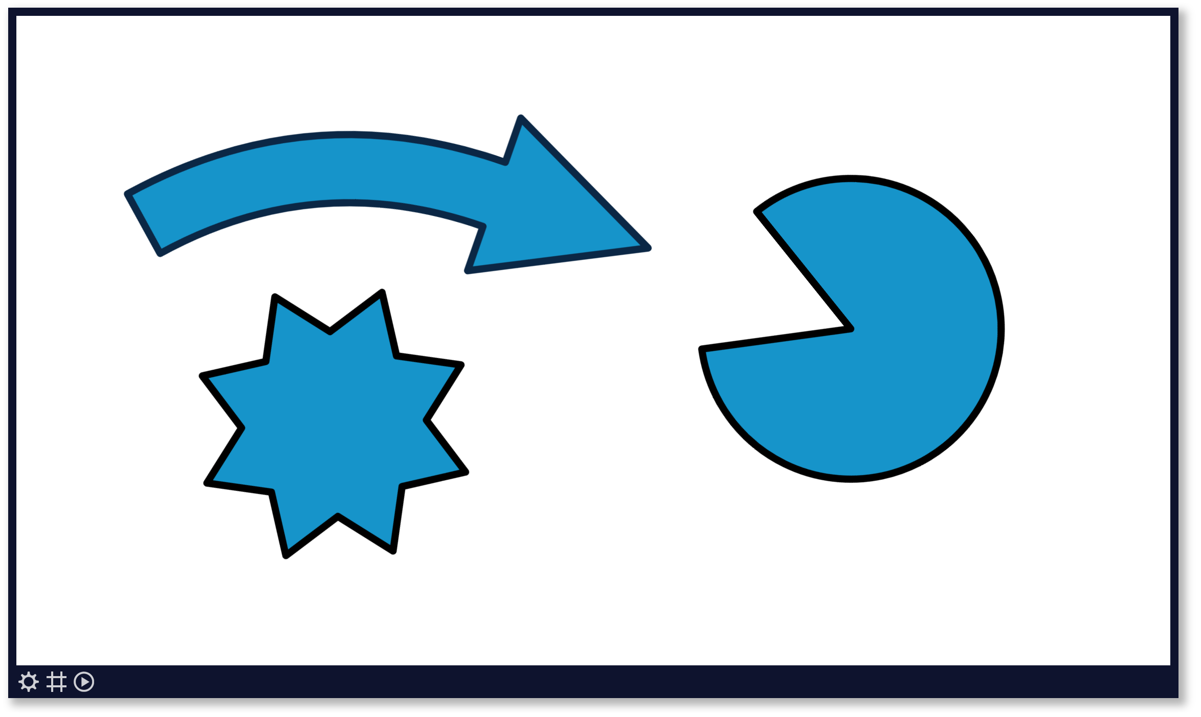
| Property | Explanation |
|---|---|
| Background color | Set the fill color of the shape. Also see our tips section. |
| Border size | Draw a border around the shape. |
| Border color | Set the border color. Also see our tips section. |
| Cut-out angle | Set the angle of the portion cut our of the pie shape. |
| Pointer orientation | Set the direction of the pointer of a callout shape. |
| Thickness | Set the thickness of the shape's body. |
| Number of points | Set the number of points of a star shape. |
| Number of sides | Set the number of sides of a polygon shape. |
| Top position | Use this to move the top of a triangle left or right. |
| Tip size | Set the size of the tip of an arrow shape. |
| Curve | Set the curve of the stem of an arrow shape. |
| Slant | Set the amount of slant of the sides of a trapezoid or parallelogram shape. |
And finally there are a number of generic app properties that you can configure that you'll find on many other elements as well.
Tip
Hold down your ALT-key while rotating a shape to quickly turn it in any direction with increments of 15 degrees, as described in the page designer's shortcut keys.